When a
complimentary ink chart from Pendemonium arrived in the mail,
I saw the wide variety of ink colors that J. Herbin makes
for fountain pens. The chart showed some colors that reminded
me strongly of the primary inks used in standard four-color
offset printing: cyan, magenta, yellow, and black. I immediately
wondered if these could be mixed to create other colors. A
little experimentation has shown me that you can mix Herbin
colors pretty easily. By varying the recipe you can get an
astonishing array of colors.
primary
colors · caveat inktor ·
mixing procedure
cyan
+ yellow · magenta + yellow ·
cyan + magenta
cyan + yellow + black · red
+ yellow · cyan + red
mixing
waterman and herbin
The four-color
process used for color printing nowadays relies on cyan, magenta,
yellow, and black inks, usually abbreviated as CMYK. The Herbin
colors that seemed closest to the process colors are:
| cyan |
= |
bleue
pervenche |
| magenta |
= |
rose
cyclamen |
| yellow |
= |
jaune
bouton d'or |
On their
own, these inks are quite marvelous. The cyan is a really
bright turquoise ink, almost too intense for writing. The
magenta is also eye-popping. I found that it has a tendency
to feather a bit more than the other inks, but in mixtures
this tendency is reduced. The yellow is bright and simple,
and has been used as a highlighter color in very wide-nibbed
pens. I haven't used it on its own.
I did
not use the Herbin black in my experiments. Instead I used
Pelikan brilliant black, which I had on hand. I'm guessing
that the kind of black used will have an effect on the resulting
colors but haven't pursued this.
I did
find it helpful to also have the Herbin red (rouge caroubier)
on hand, to compare its reactions with blue and yellow as
well. In some cases I found the red to work better than the
magenta.
The Herbin
bottles say to never mix two different inks. I don't know
whether this is a marketing ploy to encourage people to buy
their varieties, or a legal ploy to avoid litigation from
people who think an ink mixture has damaged a pen. I did a
little Internet research about mixing Herbin inks and most
people agree that these inks mix fine with each other and
with other inks.
To be
on the safe side, I am mixing my inks in small glasses and
storing the creations in separate bottles to watch for any
bad reactions, such as "sludge" or "gunk." I'd be glad to
learn from anyone who finds problems mixing Herbin inks with
each other or with other inks.
I am also
going to follow the Herbin advice of rinsing my pens well
between fillings and especially when changing colors. The
Herbin inks seem to be very free-running, but I figure frequent
rinsing can't hurt.
I bought
an Aurora Idea pen and converter for about $35 to use for
testing the new inks. If you want to do your own experiments,
consider trying the results in a pen that is not one of your
prize possessions.
I used
glass eyedroppers for each ink and mixed drops into some tapered
vodka glasses. I dipped cotton swabs in the mixtures for about
five seconds, then paused for about five seconds, then drew
two swatches on a 25% recycled ivory laid paper from Strathmore.
After
scanning the images, I eliminated the ivory tint of the background,
but you can still see the ridges of the pinstripe pattern
in the weave of the paper.
As with
Greg Clark's ink sampler, the swatches can be somewhat deceptive
because they may contain more intense concentrations of dye
than you will find with actual use in a fountain pen.
My experience
so far has been that the Herbin inks behave like watercolors:
they lay down wet, but then they dry with nice soft effects
and a variety of light and darks that makes it clear that
the line has been drawn with a fountain pen. The slightly
washed-out look may not appeal to everyone.
In the
charts, you may find some rows that are lighter in effect.
These occur when the number of drops I used to make the mixture
wasn't enough to saturate the cotton swab. In some of my later
experiments, the top row is more saturated than the second
row because I doubled the number of drops of each color in
that row.
The combinations
in each row feature the same number of drops, and you'll see
that as I decreased the amount of one color I increased the
amount of another color. This seemed like a logical way to
approach mixing simple recipes of two colors. Of course, this
doesn't give every possible combination, but you can interpolate
missing ones.
I didn't
start with 1:1 because you can see 2:2 and 3:3 in my charts.
Likewise, I didn't do a row of 2:1 and 1:2 mixes because you'll
find those colors as 4:2 and 2:4 in the third row of my charts.
Bright
greens are made by mixing the bleue pervenche and jaune bouton
d'or inks. You can really see in this chart what Michael Richter
in his discussion of green inks means by medium green in the
middle, with turquoise greens on the left and grass greens
on the right.
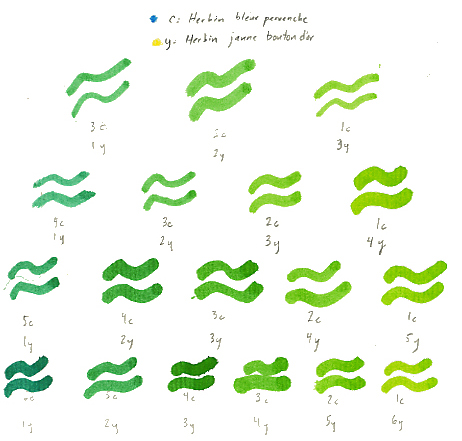
I'd say
that the 6c:1y mix shown at the lower left is virtually indistinguishable
from Herbin's verte réséda ink. Perhaps the
1c:6y mix at the other end is similar to Herbin's vert pre.
I made
a jar of the 4c:3y mix and it is a kind of bright green. See
below for my experiments adding black to achieve dark greens.
The top
row of the chart below shows what happens if you add one part
black ink (I used Pelikan brilliant black) to all the combinations
in the third row of the green chart shown above. I found that
these were too dark for what I was looking for.
I couldn't
make "half a drop" of black ink, so instead I doubled the
number of drops in my recipes and added a single drop of black
to those. The second and third rows of the chart show the
results, with intervening recipes added as appropriate.
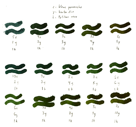
The second
row contains the "bottle greens" -- these all have more cyan
than yellow. The third row contains what might be called "moss
greens" -- these have more yellow than cyan.
The 8c:4y:1k
recipe in the center was the "bottle green" look I was seeking,
so I've been using that in a pen. Eventually I may try out
commercially available dark greens, such as Bexley's Harmony
Green or Private Reserve's Sherwood Green, to see if they
have better performance or opacity, but this 8c:4y:1k recipe
is workable for me in the interim.
I was
surprised to find that I got somewhat muddier colors when
I combined magenta + yellow than I did when I combined red
+ yellow. The colors are somewhat subdued. The scan looks
better than the actual colors.
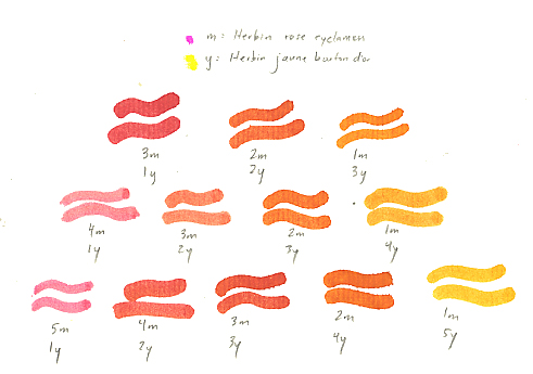
I recommend
mixing red + yellow instead of magenta + yellow if you are
looking for a really bright orange.
Bright
oranges result from mixing rouge caroubier and jaune bouton
d'or inks. The scan here is a bit deceptive; the colors at
the right are in reality a bit more yellow in tone.
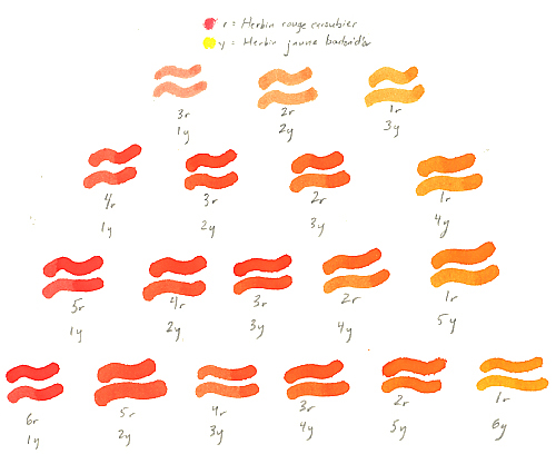
The 3r:4y
mix is the one I chose for Halloween use. In a pen, it comes
out looking a little less intense. It also has a nice property
of drying slightly darker than it lays down.
Mixing
bleue pervenche and rose cyclamen creates a nice variety of
tones ranging from turquoise to indigo to violet.
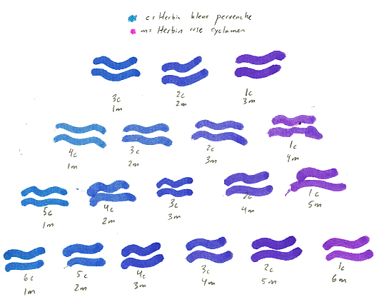
I made
a small jar of the 2c:5m mix and in a pen this comes out as
a soft purple, not as rich as the violet inks that are available,
and paler than Herbin's violette pensée, but nice.
Mixing
bleue pervenche and rouge caroubier creates subtler tones,
which I might characterize as blue, purple, and red slates.
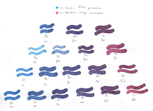
I haven't
tried any of these in a pen, but the ones in the third row
of my chart look like good candidates.
Since
I was in a mixing mood, I decided to see how my Waterman Florida
blue (bleu effaçable) and Waterman red inks work together.
Here is a quick chart.
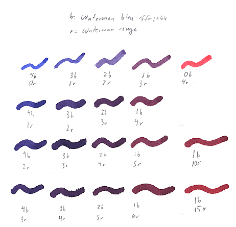
The 4b:1r
mix is a blue with a slight purple tint to it that I like
and have been using. It dries a bit lighter than it lays down,
but is more robust than Florida blue on its own.
I'm sure
that I'll try some of these other mixes. It's clear that you
can get a crimson fairly quickly this way, even without adding
black.
Waterman
Red + Herbin Yellow
I also
tried mixing Waterman red with the Herbin yellow. The result
of a 1r:1y mix was a pretty fiery red. The yellow seems to
punch up the color and make the appearance of the line smoother
and less grainy, but it's still definitely a red.
Waterman
Florida Blue + Herbin Yellow
The results
of mixing Waterman Florida blue with the Herbin yellow were
unattractive to me: very dark greenish blues and olives that
I did not wish to pursue. I'm guessing that Waterman South
Seas blue is probably better to use when trying to make greens.
I'd be
glad to hear from anyone who is also experimenting with mixing
Herbin inks, so try your own recipes and let me know what
you come up with!
William
I. Johnston
wij@world.std.com
October 2001
|