| Shell Pink:
This is one of PR’s new line of "Pastel" colors. Shell Pink is
not one of the regular "magenta" pinks like Waterman, Rotring or Pelikan
Pink. It is more like of a rose color with slight "orangeish" lobster
or salmon tones. Pelikan discontinued making their "Rose Colored" catridges,
so PR Shell Pink is the only currently made ink I know in this range of color.
It is not as intense and bright as the Pelikan ink, which looked pretty bright
red used in a pen with a fine nib and wet flow. This way it looks more elegant
and not as loud (personal taste decide if this is good or bad). I really liked
this ink on the first view. I indeed does look like pink shells you might find
on the beach!
Purple Haze:
This color also belongs to the "Pastel" colors. It is the lightest (pale
if you want) purple I have tried and lighter than the discontinued Sheaffer Lavender
and has just a touch more blue in it. I would use this color in pen which writes
with a pretty wet line and also can imagine this color to be great for mixing.
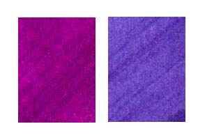
Plum and Tanzanite
Tanzanite:
This is a nice intense dark purple with blue tones. It has a touch more blue than
Waterman Violet and is not as dark. It is more intense than Rotring Ultramarine
Blue, but similar in terms of color (would make a great substitute for this color
I came across only in cartridges so far). Flow is heavy in most pens with this
ink.
Plum:
Plum is a very unique color which does not fit into the dark red / burgundy range
(Montblanc Burgundy, Parker Penman Ruby Red) but is not a regular purple either.
This color is a very impressive and intense dark magenta color with some blue
hints. It is more towards the magenta red tones than Lamy or Pelikan violet are.
It is also much brighter and intense than Sheaffer Burgundy which looks pretty
dark compared to the PR color. Plum is a heavy pigmented ink which makes it necessary
to flush pens more often.
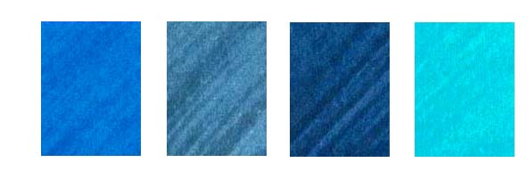
Lake Placid Blue, Sonic Blue Midnight
Blue, Naples Blue
Sonic Blue:
Sonic Blue is pretty similar to the traditional American blue-blacks as Waterman
(let’s just call the American J and Parker Quink as well in terms of color,
darkness and intensity. European blue-blacks tend to be more greyish or darker
(Pelikan, Lamy or Montblanc).
Midnight Blue:
This Dark Blue color stands out of most other blue inks. It has far more intensity
than the above mentioned traditional blue black color! It looks darker than Parker
Penman Sapphire, Omas Roma Blue or Galerie Jansen Indigo Blue and also does not
have their purple hues. It is probably the darkest "true" blue ink on
the market.
Lake Placid Blue:
Lake Placid Blue is an intense and bright medium blue. It does not have enough
purple hues to be called a "Royal Blue" (which is good in my opinion).
It is slightly lighter and less saturated than Omas Roma Blue, but has much better
intensity than Waterman Florida Blue.
Naples Blue:
Naples Blue turns out to be another cyan-blue / turquoise color similar like Waterman
South Sea Blue, Lamy Turquoise, W.B.P.(Bethge) Lotus Blue or Sheaffer Peacock
Blue. Like most PR colors it is one of the more intense colors in between Waterman
South Sea Blue and W.B.P. Lotus Blue in terms of darkness but with same intensity.
It is more towards blue, has less green tones than Waterman.

Blue Suede, Sherwood Green, Spearmint,
Avacado
Blue Suede:
Blue Suede is one of the few blue-green colors I know. If at all, it is similar
to Waterman Green but has just a touch more blue and much better intensity. This
is a very nice green which neither has the washed out look many people dislike
in most green inks nor does it belong to the forrest or bottle green colors.
Spearmint:
This is an even better substitute for the discontinued Parker Penman Emerald Green
ink. It is of equal intensity but has just a touch more yellow, which makes is
brighter. Together with Galerie Jansen Green (has less yellow but more green J)
it is the brightest and most intense medium green without any blue or turquoise
tones.
Sherwood Green:
Again this ink is very saturated. This is a dark green color less yellow but darker
than Spearmint. It is not one of the dark olive green inks like Pelikan Moss Green
or W.B.P. Reed Green. A unique (the only) true dark green. Writing with a wet
nib can cause a red shimmer from the pigments on the writing and drying time might
be slightly longer than with most inks but nothing serious a good blotter could
not get rid off.
Avacado:
Don’t ask about the spelling  ! Avacado is a dark olive green color. It is slightly less olive (less brown tones)
than Pelikan Moss Green but slightly more intense. Much more intensity than W.B.P
Reed Green or Galerie Jansen Dark Green. Makes a great substitute for the discontinued
Pelikan Moss Green.
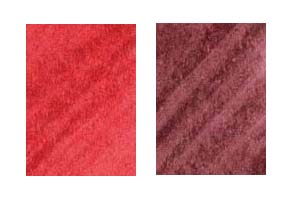
Fiesta Red and Black Cherry
Black Cherry:
Black Cherry is a typical burgundy color. While Montblanc Burgundy is the lightest
(washed out looking) burgundy I know, followed by Parker Penman Ruby Red and the
more intense Galerie Jansen Dark Red, PR Black Cherry has more brown than those,
but is very slighly less intense than Galerie Jansen Dark Red.
Fiesta Red:
This is a pretty dark medium red color and not one of those bright reds Lamy,
Waterman or Omas (Hong Kong Red) make. It is a very warm looking color with better
intensity (but equal darkness) than Omas A.V. Red and has definite orange hues.
This intensity especially stands out when using a wet writing pen. Think of a
much darker Rotring Brick Red.
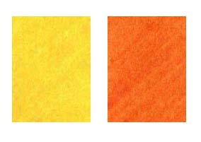
Buttercup and Orange Crush
Orange Crush:
This is the darkest Orange I know! The only similar color I came across so far
was bottled Pelikan Orange for "Nature Pens". It really has great intensity
but some might mistake this orange color I like pretty much for a "dirty"
darkened color. This is a true autumn color which would be the perfect match for
a Montblanc Hemingway or Orange Red Parker Duofold.
Buttercup:
Looking for a true intense yellow ? Well, here it is; slightly darker than Herbin
and more towards an orange yellow. I can imagine mixing bright lime greens with
Buttercup and Spearmint !
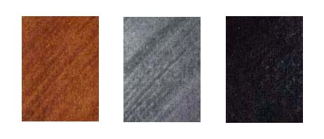
Copper Burst, Flannel Grey, Velvet Black
Copper Burst:
Everybody looking for a nice medium brown should like this one. In terms of darkness
Copper Burst is similar to Galerie Jansen Brown or Pelikan Brilliant Brown but
does not have the red tones of both of them. In terms of color it is more similar
to Omas Sepia or Caran d’Ache Brown but lighter.
Flannel Grey:
This is a simple and plain grey color (no warm brown or cold blue tones I think).
PR Flannel Grey is slightly darker than W.B.P. Flannel Grey.
Velvet Black:
It is black; ... I’m not a black ink person (I want color!!!) so I won’t
discuss if this is the deepest perfect black ink, but it is not as blue as Waterman
Black and not "dark green" as Galerie Jansen Black. It is more of a
warm black with good intensity.
When reviewing Private Reserve inks I had to use phrases like "...good
intensity...", "....most intense...", "....unique
color..." or "....good substitute for the discontinued...."
more often! This tells us that most Private Reserve inks are either unique in
terms of color (e.g. Plum, Blue Suede or Sherwood green to name a few), are the
most intense (Buttercup, Midnight Blue, Spearmint ... again only naming a few)
or make great substitutes for discontinued inks (Avacado, Orange Crush, Tanzanite,...)
and just a few don’t stand out as much ( in my opinion Sonic Blue, Black
Cherry and Velvet Black).
The pastel colors are a totally new approach in fountain pen inks. I really
like the Shell Pink and I’m really curious to try out their three new colors
Shoreline Gold, Daphne Blue and Foam Green. I followed the same discussions about
this ink and "too less intensity" was mentioned. The dictionary defines
"pastel" as a pale and delicate color, which those are; nobody should
expect a bright intense color here.
I think Terry Johnson is doing a great job in offering us a great selection
of different inks from most other colors. I have tried some of the reviewed colors
for a longer period in my pens and they all flowed well. I just hope that those
inks will become available more easily in Europe soon also.
|