|
pas-tel : (attrib) ~shades, soft, light,
delicate shades of color
...that’s how the Oxford Advanced Learner’s Dictionary of Current
English defines pastel, but is this what we want a fountain pen ink to be?
Private Reserve is known for it‘s great selection of vibrant and intense
fountain pen inks which a lot of us don’t want to miss. Colors like Sherwood
Green , Avacado or Midnight Blue are as dark as an ink color other than black
can be. Others like Plum, Naples Blue, Orange Crush or Tanzanite are among the
most intense shades in their color range.
Now the pastel line of inks is something completely different. Private Reserve
was brave enough to bring out a line of colors, "normal" fountain pen
users wouldn’t know what to use them for.
Private Reserve Pastels
When hearing about those inks for the first time, inks like Pelikan Apricot
or Rose Colored, Herbin Bleu Azure and Bethge Aubergine and Moondust came into
my mind, inks which I barely use because they are not dark enough or intense enough.
I was very curious to try them out, when the box from Indiana arrived.
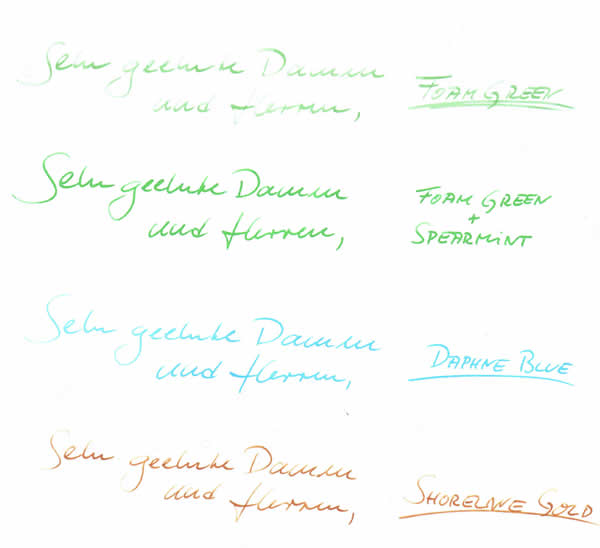
First of all, I really can confirm that Purple Haze, Shell Pink, Daphne Blue,
Foam Green and Shoreline Gold all fit their name "pastel".
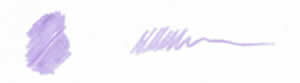
Purple Haze is the lightest (pale if you want) purple I have tried and lighter
than the discontinued Sheaffer Lavender and has just a touch more blue in it.
I’m not a big fan of purple inks so I haven’t used it much yet.
|