|
...a bottle full of thoughts
is written on the catalogue CD from Galerie Jansen I received today.
Are there already enough inks available today? One might think so, especially
when seeing the 250 different inks in my "ink - closet". But many of
those inks are no longer made, like Parker Penman and lots of nice Pelikan ink
colors. Whenever I start chatting with German pen colleagues, they state that
they don’t know where to find all those different inks (they might like).
Some years ago Herbin inks and inks made for Bethge were distributed in a
few stores but recently it seemed that those disappeared also. Most stores even
don’t carry the complete lines of Waterman, Sheaffer and Parker inks (I
had a tough time finding a bottle of Waterman Blue Black recently and ended up
with Florida Blue after four stores). It’s almost a miracle to see the complete
set of colors from the Pelikan or Montblanc ink series.
Luckily there is a source of ink which should not be overlooked. Similar to
Terry Johnson from Private Reserve inks in the US, there is one person in Germany
making everybodies ink dreams come true.
Dr. Franz - Josef Jansen is a friendly guy running a gallery in Miltenberg
am Main, Germany for asian art and everything to make a calligrapher‘s heart
jump, including a huge variety of self made inks.
Under the name DE ATRAMENTIS the Tintenmanufaktur Jansen (ink manufacture)
not only offers traditional handmade fountain pen inks, but also a lot of special
or scented and ancient inks as well as indian inks, made after recipes from different
eras. Many special series, dedicated to "teacher and pupil", "cities",
"holidays" and even mystical themes like "witches, sorcerers and
demons" are being offered.
Also individual inks are mixed upon request with special labels.
If you already have everything you need, how about a bottle of real saffron
ink or purple ink which should be one of the most exclusive inks?
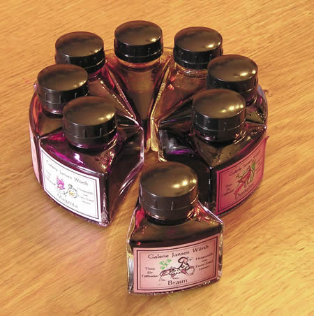
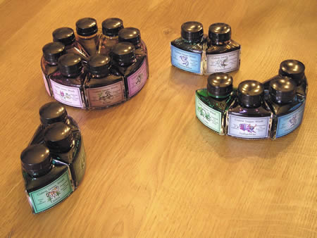
When I read a small article in a magazine some years ago, Jansen started offering
his inks in triangular (cake piece shaped) bottles, of which 8 bottles will form
a whole circle (or cake), so I ordered my first load of inks thinking this would
look nice on my desk.
Following is the first part of the review of the inks I got (Dr. Jansen seems
to be a very creative person, so he kept changing the names of the inks. Luckily
he provided a list with how the inks I have are called now. I’ve listed
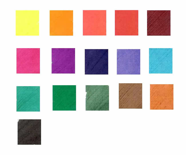
the original new and old names and also a translation of this color.Gelb (Yellow)
is a very light lemon yellow, which is almost impossible to use in a fountain
pen for writing. But this ink is almost the basic (color wheel) yellow and therefore
perfect for mixing as it doesn't’t have any green or orange-red tones in
it.
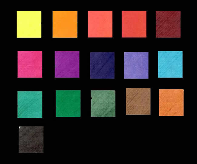
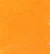
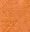
Orange / Gelb – Orange (Orange / Yellow Orange) seems
to be the brightest orange I have seen with nice yellow tones and great intensity.
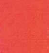
Rot (Red) is exactly the kind of red ink I don’t like
(similar to Montblanc Ruby Red or Lamy Red). I guess this light and slightly washed
out red belongs to every selection of ink colors.
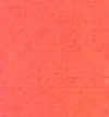
Feuerrot / Mohnrot (Fire red / Poppy Red) on the other hand
is a really nice and unique medium red color, slightly darker and towards a cherry
red with good color and intensity. This red can be used instead of the regular
reds with no problems of looking to dark or to pink.
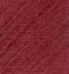
Dunkelrot / Bordeauxrot (Dark Red / Bordeaux Red) is another
nice dark red with brown hues. It is similar to Private Reserve Black Cherry but
has better intensity and is slightly more red. Definitely better in terms of color
than Parker Penman Ruby or Montblanc Bordeaux Red. I have found this ink to be
pretty "thick" which is no problem in pens with good ink flow, but might
cause some skipping in pens with already bad flow.
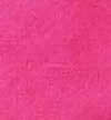
Magenta / Pink (Magenta / Pink) is a true vibrant magenta
color. This pink is similar to Waterman Pink but Galerie Jansen Magenta has better
intensity and is slightly darker.
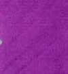
Violett / Purpurviolett (Violet / Violet) is an intense true
basic medium violet with better intensity than Sheaffer Lavender but lighter and
less blue than Waterman violet.
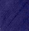
Indigoblau (Indigo Blue) stands alone as an unique dark blue
with purple hints and good intensity. It is very similar to Private Reserve Midnight
Blue (which is a true dark blue) in terms of darkness, just on the purple side.
Aurora Blue is similar in color but not nearly that dark. Cross Blue Black is
slightly more purple and less intense. Indigoblue looks very nice written but
also requires from my experience a pen with good flow.
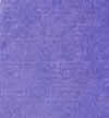
Blau / Königsblau (Blue / Royal Blue) is again one of
those colors I don’t like that much, but is a nice basic royal blue with
purple tint and compares to Rotring Royal Blue, but has better intensity. Montblanc
Royal Blue is slightly darker and more blue.
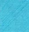
Himmelblau (Sky Blue) is a light medium turquoise blue color
leaning slightly towards the turquoise, good intensity.
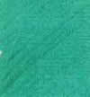
Türkisgrün (Turquoise Green) is a darker medium
turquoise green. Color is somewhat similar to Waltraud Bethge Cool Colors Turquoise
but is more towards a true green and slightly darker. Intensity can be compared
to the much more blue Private Reserve Blue Suede. Great color for everyone thinking
Waterman Green is to dark or Montblanc Emerald Green looks to washed out,
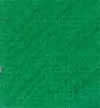
Grün / Bambusgreen (Green / Bamboo Green) is one of
the few medium green colors, which neither look too washed out or going towards
the blue - green colors, nor does it look like a dark or olive green color. Galerie
Jansen Green is a true medium green with better intensity than Herbin Ivy Green.
Private Reserve Spearmint is of similar darkness and intensity but has more yellow
tones, while Galerie Jansen Green looks more like a lighter version of Private
Reserve Sherwood Green. Galerie Jansen ink is one of my favorite regular greens
and the perfect ink for somebody searching for a true medium green and is a great
substitute for Parker Penman Emerald.
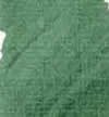
Dunkelgrün / Tannengrün (Dark Green / Fir Tree Green)
looks like a dark "british racing green" type of color somewhere in
between a "normal" dark green and a true olive green, less intense than
Private Reserve Avocado but similar to Bethge Reed Green.
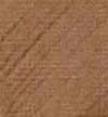
Braun (Brown) is a light medium golden brown color with slight
orange red tones (similar to Pelikan Brilliant Brown but lighter), a very nice
medium brown color.
Dunkelbraun / Sepiabraun (Dark Brown / Sepia Brown) looks
a little bit like Rotring Brown which is a darker brown with gray tones. No visible
red tones at all and fits in the same category like Sheaffer Skrip Brown.
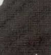
Schwarz / Nachtschwarz (Black / Night Black) looks actually
slightly green (like most black ink have some colored aspects) with OK intensity.
Do you already think this is all? Well, then keep your eyes open for the next
part of Galerie Jansen inks which is coming soon with lots of other in colors.
|