| In spite of this article's title, let me start with a single pen photo:
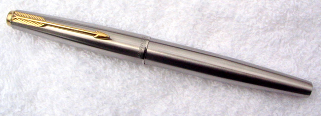
Photo 1 61/65
Oh, you say, a Parker 61 Flighter. Well, maybe. But it could also
be a Parker 65 Flighter. And that's what this article is all about:
Parker's long pattern of producing pen models that are very closely
matched. Some replaced a previous model. Others, like the 65, co-existed
with its mate. And this pattern of pairs started with the 61/65, as
fair as I can tell. Since I collect Parker Flighters, I can use Flighters
to show the similarities in these pairs in these relatively unadorned
steel pens, avoiding the unique appearance a lacquer, gold-fill, or
engraved pattern can give one of these pens.
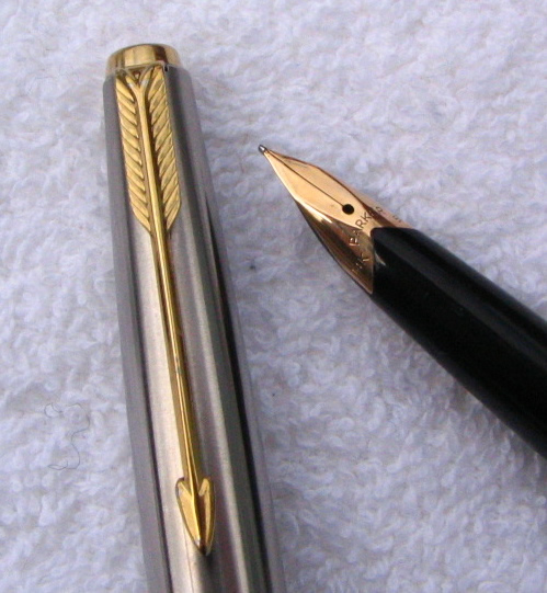
Photo 2, 61/65 nibs
I'll go through this chronologically as well as I can, and so let's
go back to the 61 and 65 to start. Since the 61's jewels were switched
to gold plated metal after the introduction of the 65 and since the
65 had grey pearl jewels early in its production cycle, there really
are no external differences. Even the filling mechanism can be the
same, since the 65 was introduced as a cartridge/converter filler
and by then the 61 was made in that mode as well. You have to look
at the nibs to see the difference and then it is profound: the 61's
hooded nib versus the 65's prominent cropped nib. Rather startling
to pull off the cap and find all that gold in view, as though one
had opened a 51 and found the big open nib of the Parker VS!
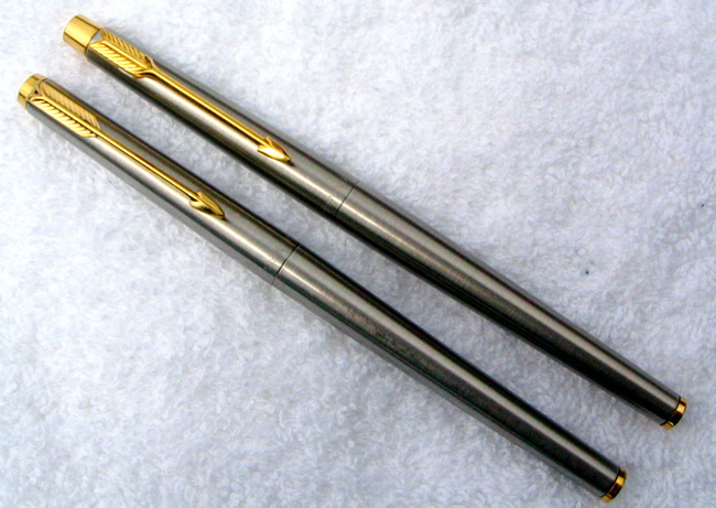
Photo 3, 180/Classic
We move on to the Parker 180 and Parker Classic. Both very slim,
the key external differences are in the way the clip is mounted and
the shape and configuration of the cap and barrel tassies. Inside,
as with the 61 and 65, the nib is quite a bit different. The 180's
nib is 14K gold and while similar in appearance to the later Classic,
both being rather unique flat, narrow triangles, the 180's nib was
intended to be used on both sides, providing a finer line on the reverse
side. The Classic, which was introduced to succeed the 180, is gold-plated
and was only meant to be used on one side for one line width.
Both pens were introduced with women in mind as the target audience,
and their slim diameters can be attributed to the perception that
women prefer slim pens, as well as the general trend in pen design
at the time. Both pens came in a very wide variety of finishes, with
the earlier 180 likely coming in a great deal more finishes than the
later Classic. However, the Classic has lasted much longer and remains
in production today, at least in its ballpoint and pencil modes.
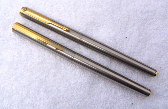
Photo 4, Arrow/95
I won't say a lot about these pens, as I don't know a lot about them
and like them even less! In my mind, they represent the nadir (I hope)
in Parker's pen design, ugly tubes with bland nibs. The Arrow came
first and was a middle tier pen. The 95, with its slightly better
fit and finish, was launched as a higher tier pen and production overlapped,
I believe. The clip on the 95 is much improved but the nibs and sections
are almost exactly the same. My 95, by the way, was made in France,
but I do not know if all 95s were made there, while the Arrow is marked "Made
in England."
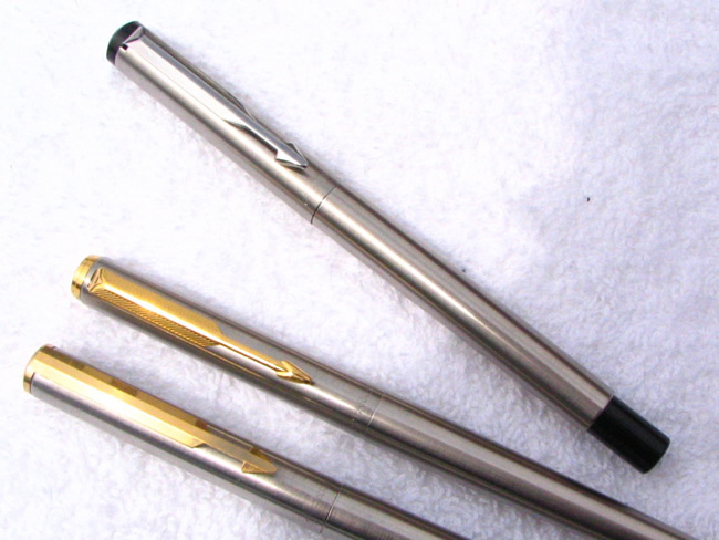
Photo 5, Vector
As you can see, these ugly siblings had a half sister, sharing the
same general clip and tassie configuration and the same tubular construction.
The nib, however, is a small steel nib, much like that of the Parker
15 (Jotter FP), and the section is steel rather than plastic. The
Vector, now replaced by the Reflex in the current Parker lineup, was
intended as a school or mass market pen. It, at least, is more honestly
what it is, in spite of the inferior nib. Not that I feel strongly
about these pens!
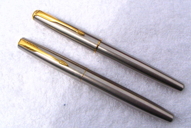
Photo 6, Frontier and Sonnet
What can one say about two models who are so closely related that
one can swap the modular nibs between them? The Frontier is constructed
as a more modest pen, but our own Vivek Narayanan has very ably outlined
the virtues of this pen. The Sonnet has had several styling changes
over the year. I must admit I first bought a current model Sonnet
Flighter for my collection and absolutely hated it: the finish of
the stainless steel was a different tone that any other Parker Flighter
and the very wide, garishly yellow gold plated cap band was not attractive
in my eyes.
The Sonnet has been made in many finishes, including gold and silver
plated patterns and several sterling silver models. The Frontier has
been made in a number of more modest but also interesting finishes.
In the stainless steel mode, there is very little difference between
them and some of those differences, like the comfortable section of
the Frontier and the section ring of the Sonnet, vulnerable to corrosion
from ink, could point a reasonable user toward the Frontier as the
preferred instrument.
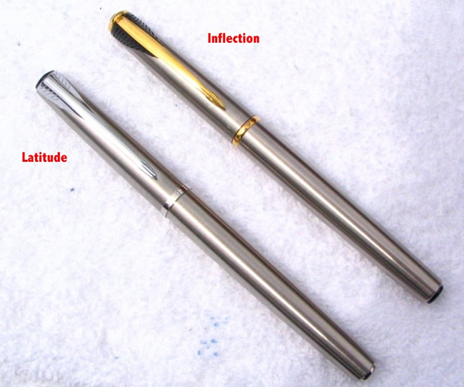
Photo 7, Inflection and Latitude
Two recent models here: the Inflection, just a few years old but
already discontinued and what appears to be its replacement, although
at a lower price point. But they are clearly close siblings, with
the new Latitude following the general trends of the Inflection: the
slanted cap ends and barrel and cap tassies, wide feathering of the
arrow clip (albeit with the feathers in metal and integrated with
the length of the clip), and the same general size and body shape.
The Latitude Flighter does not sport the cap grooves of the blue
and black lacquered models. At this time, the Latitude Flighter is
only offered with chrome trim, while the Inflection was only offered
with gold plated trim (purists, by the way, do not deem a stainless
steel model with other than gold filled or plated trim to be a true
Flighter, following the model of the original Parker Flighter, the
51). But the Latitude, in spite of its lower price, does have nicer
chrome tassies on cap and barrel, compared to the plastic ones on
the Inflection.
When I got my Inflection I had to straighten the teardrop shaped
cap tassie, which was mounted crookedly. I also had to sand the plastic
mold seams on the section--they were rough and very noticeable. On
the Latitude, the chrome tassies are well mounted and while there
are seams on the section, they are not anywhere nearly as apparent
as with the Infection.
On the Inflection, the "cap band" is actually part of the
barrel and the cap snaps onto a plastic ridge on the section near
the nib. The Latitude also appears to snap--with a crisp, audible
snap--onto a similar section ring, but it has a highly polished cap
lip and the chromed barrel ring is almost invisible.
It's the nibs once again that are most different between these two
models. The Inflection has a gold-plated nib that is semi-hooded,
giving an appearance something like that of the Parker 45 nib. The
Latitude's polished steel nib is an open one, rather stubby nib, similar
to nibs on some of Parkers lower end pens.
It seems clear, looking at these five sets of pens, and even looking
back at the Parker 51 and 21 or the Parker 75 and Premier, that when
Parker has felt it has a successful design, the company's tendency
is to elaborate that design into a more successful design. Providing
a new trim level or offering an improved nib is a way to reach buyers
that the original model didn't appear to. This is hardly unique to
Parker. From Esterbrook to Sheaffer to Mont Blanc to Hero, pen makers
have used this technique since the earliest days of the fountain pen
to extend the life of a model and reach the broadest possible market.
These Flighter models give a simple illustration of that principle.
|